Practical guide · Apple revenue
Make a Treemap with Apple revenue data
Show how Apple’s revenue mix changed from fiscal 2021 to 2025. Start with the existing data or keep the complete square Financial composition and five category pictograms.
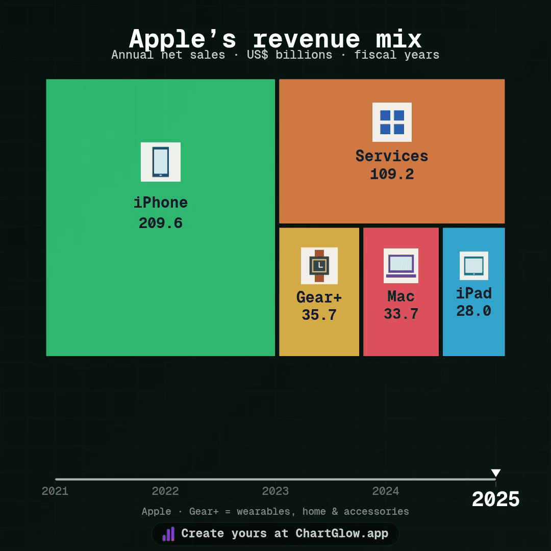
1. Choose one starting point
Open the apple-revenue dataset and choose Use this dataset. It creates a separate chart with the supplied data and a native Treemap starter. The complete project keeps the saved Treemap, five pictograms, Financial styling and complete Square (1:1) layout; choose Use this project there instead if you want that composition.
Sign in and confirm your email if asked, then return to the same item and choose its Use button. Signing in alone does not create a chart. Your existing work stays intact. Free accounts allow 5 saved projects; at the limit, you can keep editing an existing chart. Free exports include the ChartGlow watermark.
2. Map the columns — keep each fiscal year separate
In Data, review the 25 observations: five categories for each fiscal year from 2021 to 2025. In Columns, keep:
- Entity → name: iPhone, Mac, iPad, Gear+ or Services.
- Time → year: fiscal years ordered ascending.
- Value → value: annual nominal net sales in USD billions.
- Series Image → image: the supplied HTTPS category pictogram.
Choose Treemap in chart settings. Both starting points already use it. Keep Cumulative Sum OFF: each value belongs to one fiscal year; adding years would change the question. Keep Fill Missing Values OFF; an absent observation is not a zero. The existing dataset has no missing observations.
3. Read the mix, then compare the dollars
Revenue is annual net sales, not profit or cumulative sales. Values are nominal USD billions: Apple’s reported USD millions divided by 1,000, without inflation adjustment. These are fiscal years ending in September, not calendar years. FY2023 has 53 weeks; the other four have 52, so the reporting windows differ.
The five categories are disjoint and sum to each fiscal year’s total; do not add a separate total tile. Gear+ means the full Wearables, Home and Accessories category. Its watch pictogram is symbolic, not watch-only revenue. Product and service assortments change over time.
Treemap areas show relative shares within each fiscal year and are rescaled to fit the chart. A category can occupy less space even when its revenue rises, if the total grows faster. Compare the displayed USD billion values across years: screen area is not a fixed dollar scale, and tile position is not a Bar ranking.
Gutters leave gaps between tiles, so visible pixels are an approximate guide to shares. Movement between annual points is visual interpolation, not extra observations. Keep fiscal years, units and source visible; read the labels at an annual point for reported values.
Choose Use this project to retain the complete Financial · Square (1:1) composition, adapted from Universal safe zones, with its five pictograms and saved margins. For a fresh social layout, review Platform Safe Zones → Universal and check the result at your chosen format.
Play Preview at desktop and phone size. Check title, subtitle, fiscal year, category names, values and images at the beginning, middle and end. Watch transitions until labels settle. Wait for Saved, reload the same chart and check your changes.
4. Export and open your MP4
Open Export in the editor header. Choose Format → MP4, then an available Resolution and Smoothness: 720p or 1080p, 30 or 60 FPS. Square 1080p is 1080 × 1080 pixels; encoding depends on your browser and device.
Choose Start Export and keep the tab open. Open the downloaded file and check the beginning, transitions and end at phone size. A completion message alone does not confirm a readable video. Export downloads a file; it does not publish a social post. Use the social-video export guide for more detail, or watch the existing Apple-revenue MP4 without creating another chart.
Keep the source and image record
- Data: Apple Newsroom consolidated financial statements, page 1, Net sales by category, twelve-month columns: FY2022 report (FY2021–2022), FY2023 report, and FY2025 report (FY2024–2025).
- This is the saved 18 October 2026 snapshot, not a live feed. Retain attribution to Apple’s published results.
- Images: five original geometric category pictograms created for ChartGlow, with no Apple logos or implied endorsement. The watch symbolizes the broader Gear+ category; the app grid represents Services. Source PDFs are not used as illustrations.
- Saved source, method and image-rights record.