Practical guide · Data interpretation
How to choose and read a racing chart
By ChartGlow ·
Before asking who wins the race, ask what is being measured, who is included, and which dates actually have data. A clear animation helps viewers follow a comparison; its movement does not make the comparison representative or explain its causes.
Choose the chart from the question
Bar: who leads at each date?
Ordered bars make rank changes easy to follow. Use them for a selected-country nuclear-output ranking or subscription-density comparison. Rank only says where an entity stands within the included, visible comparison.
Explore the Bar chart guide →Line: how did values and gaps change?
Lines keep comparable trajectories in view. Use them to follow the US–China–India life-expectancy gap. Keep units and axis limits consistent, and explain sparse dates before reading slopes.
Compare Line and Bar →Changing the chart type does not change a unit, fill gaps in the source, or turn selected countries into the world. If you show only the top items, distinguish the displayed ranks from the full dataset and the source’s geographic coverage.
Four mistakes, with corrections you can use
These examples reuse the existing analyses and their accepted native videos. Follow each link for the complete table, downloadable chart data, source, method, and limitations.
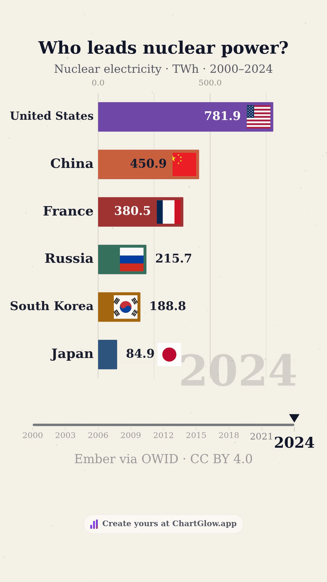
Nuclear: name the selection and metric
TWh · 6 selected countries · annual values, 2000–2024
Mistake: The chart proves which country relies most on nuclear power.
Correction: The United States generated 781.86 TWh in 2024, ahead of China at 450.85 TWh within this selection. Total nuclear output is not nuclear’s share of the electricity mix. A six-country selection alone cannot prove a world ranking.
Apply it: Use Bar for a ranking of output. Put “six selected countries” and “TWh” beside the title. To compare reliance, you would need a different metric and its denominator.
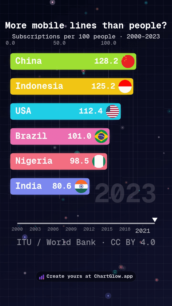
Mobile: subscriptions are not people
Subscriptions per 100 people · 6 selected countries · annual values, 2000–2023
Mistake: 128.2% of people in China owned a phone in 2023.
Correction: China had 128.2 mobile cellular subscriptions per 100 people in the accepted series. People can have multiple subscriptions; this ratio can exceed 100. It does not identify the number of unique owners or users.
Apply it: Keep “subscriptions per 100 people” as the unit. China’s endpoint change from 6.7 to 128.2 is 121.5 subscriptions per 100 people, not a percentage-point change in phone ownership.
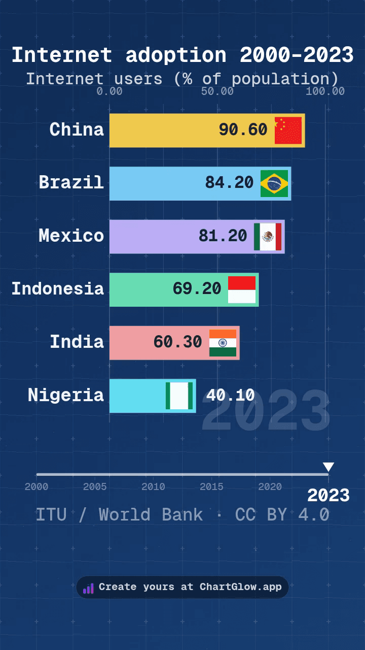
Internet: a share is not a user count
Percent of population · 6 selected countries · 6 reported dates, 2000–2023
Mistake: The highest percentage means the largest number of internet users.
Correction: 90.6% in China and 40.1% in Nigeria in 2023 describe shares of each country’s population. Their difference is 50.5 percentage points. The percentage ranking alone does not rank total user counts.
Apply it: Specify the denominator. This ITU indicator concerns internet use in the last three months, not connection quality, affordability, or a home subscription. Do not sum national percentages into a world total.
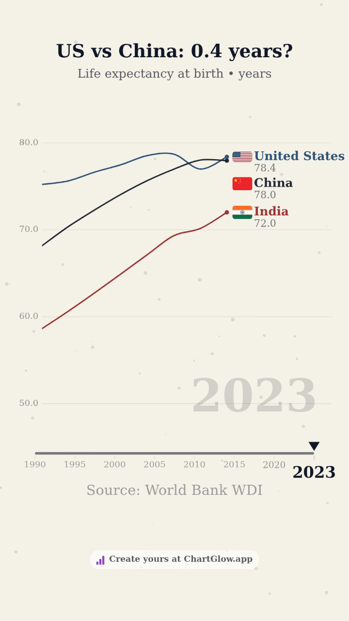
Life expectancy: a gap is not an explanation
Life expectancy at birth (years) · US, China and India · 8 reported dates, 1990–2023
Mistake: A narrowing gap proves which policy worked, and the video shows when it happened.
Correction: The reported US–China gap narrowed from 7.1 years in 1990 to 0.4 years in 2023, rounded to one decimal. These selected period estimates do not establish a cause or an exact crossing date between observations.
Apply it: Use Line to follow trajectories and gaps. Life expectancy at birth summarizes mortality conditions for a period; it is not a forecast of an individual newborn’s lifetime. This example uses a labeled 50–85-year axis, so read the values rather than treating distance from the bottom as a ratio.
Percent, percentage points, and totals
A rise from 5% to 10% is 5 percentage points, or a 100% relative increase. These answer different questions. State which one you mean; relative growth becomes especially sensitive when the starting value is near zero.
Countries have different population sizes. Do not add their internet-use percentages or take an unweighted average and call it a world share. A combined share would need compatible definitions, the relevant populations, and a clearly stated geographic scope. The six-country chart supplies no such world total.
Check any summary against the unit: summing TWh across distinct countries and the same period can describe their combined output; summing life-expectancy estimates, national percentages, or subscriptions-per-100 ratios does not describe a meaningful combined total. In ChartGlow, turn Show Summary off when its calculation would mislead.
Separate reported dates from animated frames
Nuclear uses annual values from 2000 to 2024; Mobile uses annual values from 2000 to 2023. The Internet analysis shows 2000, 2005, 2010, 2015, 2020 and 2023. Life expectancy shows 1990, 1995, 2000, 2005, 2010, 2015, 2020 and 2023. These historical windows do not claim to be live readings.
The accepted Internet Line starter has three countries and 18 observations; the Internet Bar analysis has six countries and 36 observations. They share an indicator and selected dates, but their country sets differ. Compare the question and unit without treating them as identical datasets.
Between reported dates, the animation interpolates positions and values to show movement. Those intermediate frames are not new measurements. In the accepted sparse Line examples, selected dates advance in equal animation steps, including the shorter 2020–2023 interval. A faster-looking segment is not evidence of faster annual change; calculate a time-based rate from the reported values and actual calendar interval if that is your question.
Source estimation is a separate layer: life expectancy is itself an estimated period measure. Read the source method as well as the chart’s interpolation note. Do not infer a precise real-world crossing date or an unobserved event from a smooth transition.
Brief crossings and overlaps during rank changes can be normal. Review moments before, during and after a crossing: labels should recover and motion should stay coherent. Persistent unreadability, clipping, unexplained disappearance, or erratic movement needs correction before sharing. A single paused overlap is not enough to diagnose a defect.
Before sharing: five checks
- Scope: name the included entities and dates. Say “selected countries” when that is what you have; a hidden or missing entity is not a zero.
- Unit: identify counts, rates, shares, or years. Keep the denominator visible and match any summary to the measure.
- Source: retain the indicator, provider, licence, snapshot, and transformations. A value rounded to 0.0 can still be positive; do not infer absence from rounding.
- Presentation: choose Bar or Line in the native editor, show country flags, label axes and dates, and use Platform Safe Zones → Universal for a social video.
- Review: inspect Preview and your exported MP4 at phone size, including crossings and the ending. Distinguish the numerical finding from an explanation that the data cannot establish.
For the actual import, field mapping, flags, and export steps, use the CSV racing chart guide. This guide helps you decide what a chart can responsibly say.
Check the definitions at their sources
- Nuclear generation: Ember Yearly Electricity Data, via Our World in Data’s sourced electricity series.
- Mobile: ITU via World Bank, mobile cellular subscriptions per 100 people.
- Internet: ITU via World Bank, individuals using the internet (% of population).
- Life expectancy: World Bank WDI definition and underlying population sources.
Examples and posters reuse the accepted ChartGlow publications linked above; no new observations have been added. Their analyses retain the detailed source snapshots and rights. World Bank indicators list CC BY 4.0; the nuclear article retains Ember/OWID attribution. Country flags use Flagpedia public-domain assets through the native Auto Flags feature. Data providers do not endorse this guide.