Practical guide · CSV to video
How to prepare a CSV for a racing chart
Start with a small, sourced table. Give each row an entity, a period, and a numeric value, then check how ChartGlow interprets it before replacing data.
Still shaping the idea? Turn it into a clear chart request before preparing your table.
1. Use a long table: one entity and period per row
A clear long-format layout for a racing chart uses three columns. The names can differ in your file: map them explicitly in Fields. If your spreadsheet has a separate column for each year, reshape it into this long layout first.
| CSV header | Purpose | Fields mapping |
|---|---|---|
| country | Entity: the series to follow | Entity Column |
| year | Time: the observation period | Time Column or Order Source |
| value | Metric: a number in one consistent unit | Value / Metric Column |
country,year,value
Mexico,2000,5.1
China,2000,1.8
Indonesia,2000,0.9
Excerpt: the three observations for 2000. The download contains 18 rows for three countries across 2000, 2005, 2010, 2015, 2020, and 2023; the header is not a data row.
2. Check the numbers before you import
- Keep entity names consistent across periods. Aim for one observation per entity and period; resolve duplicates against your source.
- Use a header row and consistent row lengths. For this example, use comma separators and a decimal point, such as 5.1. Keep % signs, units, and thousands separators out of the numeric cells. Quote text containing a comma.
- Use the same unit for every series. Here, 5.1 means 5.1% of the population, not 5.1 people or total internet users. Do not add national percentages together.
- Check missing observations against the source. Unknown is not zero. Fill Missing Values carries previous values forward; use it only when that interpretation is justified and explain the transformation.
- Keep the source, licence, period, and any rounding with your chart. The starter is an illustrative subset rounded to one decimal place, not a global ranking or a claim to the latest dataset.
See why the unit matters: mobile subscriptions per 100 people are not unique users, while internet-use percentages describe recent use, not connection quality. Both analyses keep the metric definition and limits beside the numbers.
Before choosing the story, check selected rankings, units, percentages, and interpolation. The interpretation guide shows four common mistakes and corrections using the existing analyses.
3. Import, map, and create your first racing chart
- Open the native editor. Download and check the CSV, open New chart, and sign in if asked. Choose Upload a file and select the CSV to create a chart directly. To replace an existing chart’s table with a review first, use Data → Add data → CSV / Excel File inside its editor. On mobile, Data is the Edit data icon.
- Check the imported table. In Data, confirm 18 rows and the country/year/value columns. For an editor replacement, Review CSV import shows the dimensions, headers, and first five prepared rows before applying anything. Scroll the sample sideways if needed. Replace data replaces the entire current dataset; Cancel, Close, or Escape leaves it unchanged.
- Confirm Fields. Set Entity Column → country, Time Column or Order Source → year, Order → Ascending, and Value / Metric Column → value. On mobile, return to Preview chart and open Open chart settings → Fields.
- Choose the question. Chart → Chart Type → Line follows trajectories and gaps. Bar emphasises who leads at each period. For the accepted Line example, use Portrait, Platform Safe Zones → Universal, Y Min 0, Y Max 100, and Dynamic X Scale off. This keeps the full timeline visible.
- Add country flags and context. Data → Tools → Add country flags opens Auto Flags. Select country as the name column and check all three countries. In Fields, associate flag with Floating Image Source and Flag Pattern Source, then set Decimals to 1. Use rectangular flag images, a clear title, the percentage unit, and the ITU / World Bank source. Turn Show Summary off for these percentages.
- Save and review the animation. Wait for Saved, reload the same project, and check Preview at the final format on desktop and mobile. Use Play, Pause, and the timeline. Brief crossings are normal if labels recover and motion remains coherent. The selected years are spaced equally in this animation despite unequal calendar gaps; animation speed does not measure annual growth.
- Export and inspect the file. Use Export → MP4, select an available quality and frame rate, then Start Export. Keep the tab open and open the received MP4; check the beginning, crossings, and end on a phone-sized screen. Free exports retain their watermark. The linked example used Classic, a 10-second chart plus the native final hold, and 1080p / 30 FPS; check the options available in your own browser.
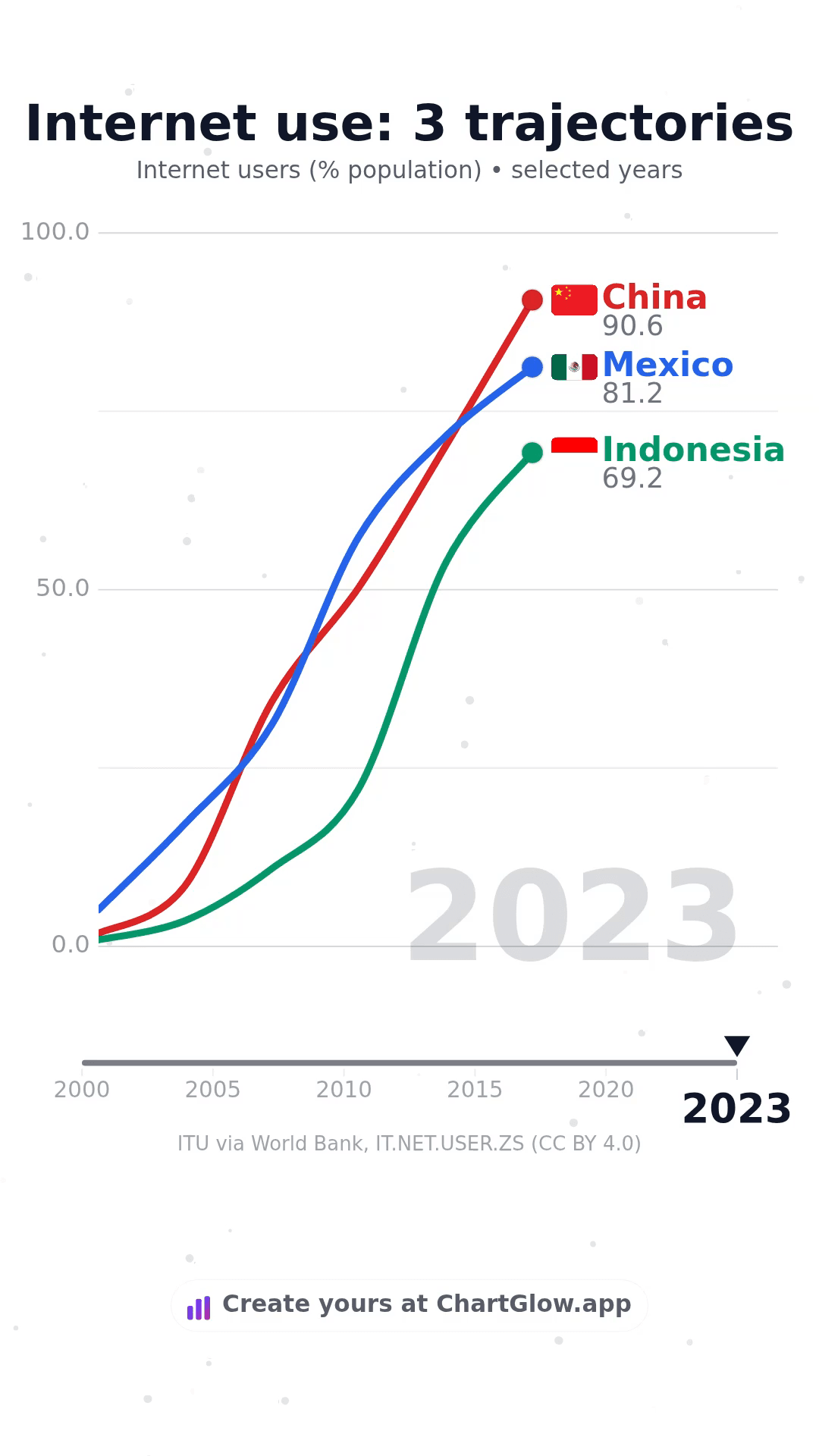
See the finished Line example
The existing native video uses these same 18 observations. Motion between them is visual interpolation, not extra measurements.
Watch the example and its full settings →Data: ITU via World Bank, IT.NET.USER.ZS · CC BY 4.0. Selected and rounded. Flags: Flagcdn / Flagpedia public-domain flags.
Data ready? Prepare a readable social video and check the exported MP4: format, Universal safe zones, flags, Preview, and the received file.
Fix a CSV import: find your symptom
Start with what you can see in Data or the import review. These checks use ChartGlow’s existing controls; they do not automatically repair a file or verify its source.
The CSV will not import, or the sample has the wrong columns
- Check
- Compare the review’s headers and prepared sample with your source. A header-only file has no observations. A separator fallback does not mean ChartGlow fixed the file.
- Correct
- Cancel the review. In your source spreadsheet, keep one header row, at least one data row, matching row lengths, and balanced quotes. For the starter layout, export a comma-separated CSV with country,year,value. Quote a text cell containing a comma; check the exported file rather than its extension alone.
- Resume
- Select the corrected file again through Add data → CSV / Excel File. Verify the headers, dimensions, and first five prepared rows before Replace data. If the sample still differs, cancel again; the review has no separator picker or header-repair control.
Names appear as values, or the chart follows the wrong column
- Check
- Compare a known row in Data with Preview → Fields. Auto-detection can choose a different column; replacing a table with new headers can require new mappings.
- Correct
- For the starter, set Entity Column → country, Time Column or Order Source → year, and Value / Metric Column → value. For your own file, select the columns with those actual meanings. Set Order → Ascending for time moving forward; Highest / Lowest controls metric ranking separately.
- Resume
- On mobile, return to Preview chart → Open chart settings → Fields. Compare names, periods, and values with the source in Preview, then wait for Saved. A mapping change does not clean the cells or change their unit; use the number check below if the metric still looks wrong.
Number conversion blocked, or numeric cells still contain text
- Check
- In Data, open Column options for the metric → Type (…) → Number. This checks the whole column, including rows outside a selection or search. A refusal shows Number conversion blocked, the affected count, and up to five examples with dataset row numbers. This is a column-conversion message, not a CSV-import message.
- Correct
- Choose Back to data and verify the intended value and unit against the source. A confirmed decimal 1,5 should be written as 1.5. A confirmed count of one thousand two hundred thirty-four should be 1234; do not guess whether 1,234 means that count or a decimal. For a percentage stored as percentage points, write 5.1 instead of 5.1% and keep the % unit in the chart text. Do not silently convert it to the fraction 0.051. Remove currency/unit text only after verifying what it means.
- Resume
- Edit the verified cell and use Tab or leave the cell to validate; repeat Number for the whole column. A refusal changes neither data nor type. Empty cells stay empty, not zero. Scientific notation, non-finite values, and values that lose precision can also be refused: return to the source rather than rounding them blindly. After success, confirm Value / Metric Column and the unit in Fields/Preview, then wait for Saved.
Dates run backwards or periods appear in an unexpected order
- Check
- Confirm the time column and Order in Fields, then compare the raw period cells in Data. Mixed date formats or ambiguous labels such as 01/02/2023 need a source check. Display changes how a detected date is shown; it does not validate every row or repair the source dates.
- Correct
- For annual observations, use consistent years such as 2000, 2005, and 2023. For full dates, first establish which day and month the source means, then use one consistent, zero-padded year-month-day form, such as 2023-02-01 for 1 February. Do this deliberately in the source spreadsheet; ChartGlow does not provide an automatic date-repair step.
- Resume
- If you changed the CSV, reopen the replacement review and verify its prepared period values before applying. Map Time Column or Order Source explicitly and select Ascending. Step through the first, middle, and last periods in Preview to confirm the intended sequence, then wait for Saved. Unequal calendar gaps in the starter do not turn its animation speed into annual growth.
Rows or columns are missing after preparation
- Check
- Compare Rows received / Rows to import and Columns received / Columns to import in the review. Data will be truncated. announces limits separately: only the first 5,000 rows and 10 columns are retained. The header is not a data row, and only five prepared rows are shown in the sample; the sample is not the complete file.
- Correct
- Cancel and deliberately reduce the source to a relevant subset within both limits, keeping the entity, time, and metric columns. Preserve the original file and document the selection. Do not replace the table repeatedly to append pieces: Replace data replaces all its rows.
- Resume
- Reopen the reduced CSV and compare received/retained counts and headers before confirming. If the counts match but a series is absent in Preview, check Fields → Data Filtering, Values to Show, and Chart → Max Items before assuming data was deleted. Confirm the full table in Data.
No country flags? Ordinary CSV imports do not add country images automatically. Use Data → Tools → Add country flags, resolve unrecognised names, and check the flag associations in Preview. Assets for other categories need verified sources and rights.
Save failed? Keep the tab open, use Retry, and wait for Saved before leaving or reloading. A download or Preview is not proof of a saved edit.
Need a known starting point? Choose an accepted Bar or Line example and its exact CSV, or return to the native import steps above. A reviewed table still needs verified sources, Preview, and inspection of your actual exported MP4 before publication.
Start with the CSV, then tell one clear story
Use Line for trends or Bar for rankings. Keep your unit and source visible, and review the actual exported video.
Open New chart