Practical guide · Mauna Loa CO₂
Make an animated CO₂ line chart with Mauna Loa data
Turn 67 annual CO₂ measurements into a moving line, then export your own MP4. Start with the finished chart to keep its look, or use the same data to build your own style.
1. Choose your starting point
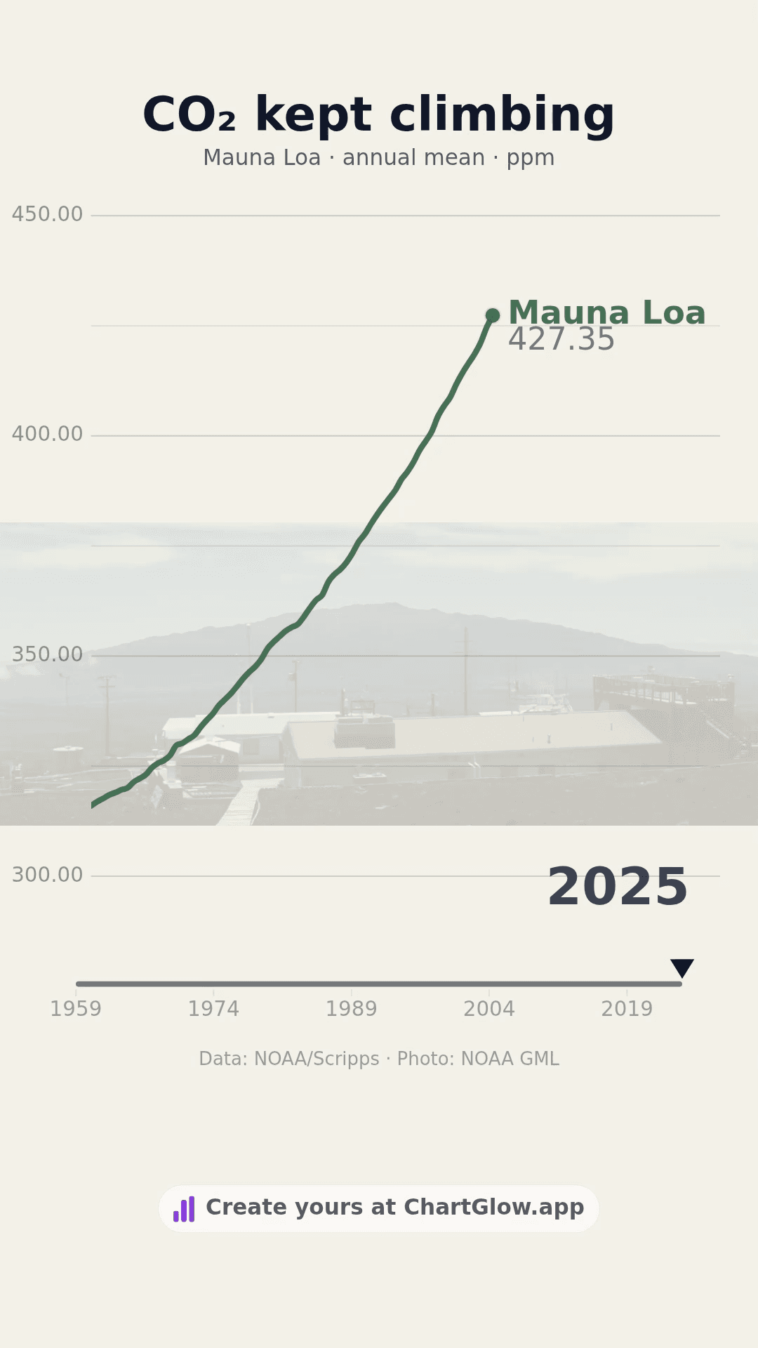
The complete project includes the data, Line chart, Nature theme, observatory photo and portrait layout. You can watch its existing video before making a copy. Choose Use this project to keep that composition.
The dataset contains the same observations, with a starter chart rather than the finished design. Choose Use this dataset if you want to make the visual choices yourself.
Sign in and confirm your email if asked, then return to the same item and choose its Use button. Signing in alone does not create a chart. Either choice creates one separate chart in your account and keeps your existing work. You only need one starting point.
Free accounts allow 5 saved projects. If you have reached that limit, you can keep editing an existing chart. Free MP4 and GIF exports include the ChartGlow watermark. This guide uses the supplied data and manual controls; no AI generation is needed.
2. Know what the line measures
The table contains one series, Mauna Loa, with one annual mean for every year from 1959 through 2025: 315.98 ppm at the start and 427.35 ppm at the end. This saved selection contains no partial 2026 value.
ppm means parts per million in dry air. This is CO₂ concentration, not the amount emitted each year. Do not add the annual concentrations together or label them “total emissions.” The original project hides the summary; keep Labels → Show Summary off for this chart.
This is an observatory record, not a global average. After the Mauna Loa eruption interrupted measurements, observations from December 2022 through 4 July 2023 came from nearby Maunakea. Keep that note when describing the series. NOAA may revise values after quality checks; this example uses the source file dated 9 October 2026.
3. Keep the columns and dates straight
Open Data to inspect the table. It has 67 rows and three useful columns: Year, Series and CO2_ppm. Keep those names and values when following this example.
In Columns, use Series for the entity, Year for time and CO2_ppm for the value. Keep the years in ascending order. Choose Line in Chart if you started from the dataset. On a phone, open Chart in the bottom bar to reach the chart settings.
Need a file instead? Download the same CSV and follow the CSV import guide. A CSV keeps the data, not the finished chart design. The linked NOAA original also retains an uncertainty column that is not plotted here.
4. Make the chart readable
Keep the title short and name the unit. For example: CO₂ kept climbing, with Mauna Loa · annual mean · ppm below it. Keep a visible NOAA/Scripps source credit.
The complete project uses a clearly labeled 300–450 ppm vertical range. In Chart → Axis Ranges, check Y Min and Y Max if you build your own version. A scale starting at 300 makes changes easier to see; the visible line height is not a proportion of a zero baseline.
Change the theme before final positioning. For a portrait video, choose Portrait (9:16) and apply Platform Safe Zones → Universal after choosing the chart type and format. Keep the observatory image subtle enough to read every number. Line does not use Dynamic Bar Height.
Play Preview at desktop and phone size. Read the title, subtitle, year, axis values and source together at the beginning, middle and end. If the large year sits behind a value, adjust its size or position in Labels. Wait for Saved, reload the same chart and check your changes.
The line moves between annual observations to make the animation continuous. Those in-between frames are visual interpolation, not extra measurements. Annual means do not show the monthly seasonal cycle, and playback speed is not a measured CO₂ growth rate. See how to interpret racing charts for more context.
5. Export and open your MP4
Open Export in the editor header and choose Format → MP4. Under Resolution and Smoothness, choose an available size and frame rate. MP4 offers 720p or 1080p and 30 or 60 FPS; portrait 1080p is 1080 × 1920 pixels. Encoding depends on your browser and device. Free exports keep their watermark.
Choose Start Export and keep the tab open. Open the downloaded file and check the beginning, middle and end at phone size. Confirm that the year, values and source remain readable. A completion message alone does not confirm a usable download. Export gives you a file; it does not publish it to a social account.
For more detail, use the readable social-video export guide. You can also watch the existing Mauna Loa MP4 without creating or exporting another chart.
Sources and reuse
- Data: NOAA GML annual mean CO₂ CSV, file dated 9 October 2026, checked 16 October 2026. Credit: Lan, X., Tans, P. and K. W. Thoning, NOAA Global Monitoring Laboratory; early measurements by C. David Keeling, Scripps Institution of Oceanography. Data are freely available with citation; the 67 means are unchanged.
- Definitions, site change and revisions: NOAA Trends in Atmospheric CO₂ and data documentation.
- Existing photo: NOAA Global Monitoring Laboratory, Boulder, Colorado, USA. NOAA material is public domain unless otherwise marked; retain the credit and follow NOAA’s reuse conditions. This independent visualization does not imply NOAA endorsement.
- Example source and rights record.